





Our next chapter begins now
Refinement to nettletontribe.
For more than 55 years, nettletontribe has built a strong reputation for architectural excellence, enduring relationships, design intelligence, practical thinking and the ability to deliver complex projects with care and clarity.
That foundation has not changed.
What has changed is the scale of our ambition, the momentum across the business and the opportunity ahead. nettletontribe is continuing to grow, evolve and strengthen. Across our studios, sectors and teams, there is a renewed sense of focus around where the practice is heading and how we want to show up in the market.
A brand is not just a logo. This is the full picture of how we communicate who we are: the words we use, the way we present our work, the behaviours we reinforce, the stories we tell and the impression we leave with clients, collaborators, communities and future talent.
Built from the inside out
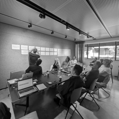
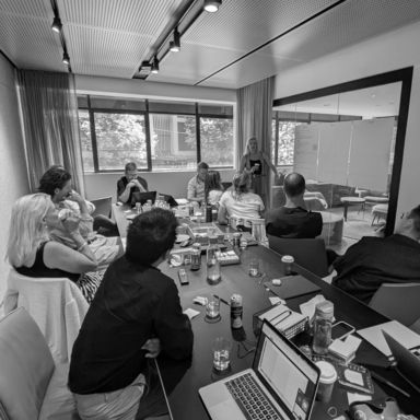
This has been a whole-practice process.
Over many months, the full team at nettletontribe have contributed through surveys, interviews, workshops, conversations and feedback. We spoke with team members across different studios, roles, sectors and levels of the business to better understand what makes nettletontribe distinctive from the inside.
We also looked beyond ourselves.
We reviewed how clients experience the practice, how the market sees us, where our strongest opportunities lie and how our brand could work harder across the many places people encounter our people and our designed places.
A more refined & flexible identity system
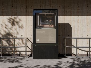
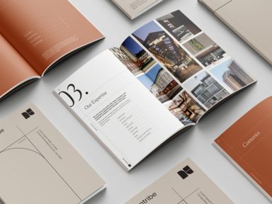
The refreshed expression introduces a coordinated brand system, designed to feel unmistakably connected to architecture and to the way nettletontribe thinks.
The design language takes inspiration from architectural drawings: the discipline of structure, proportion, grids, linework, spatial relationships and carefully composed layouts. This gives the brand a more considered and systematic visual rhythm, one that feels precise, confident and grounded in the practice of design.
The Monogram
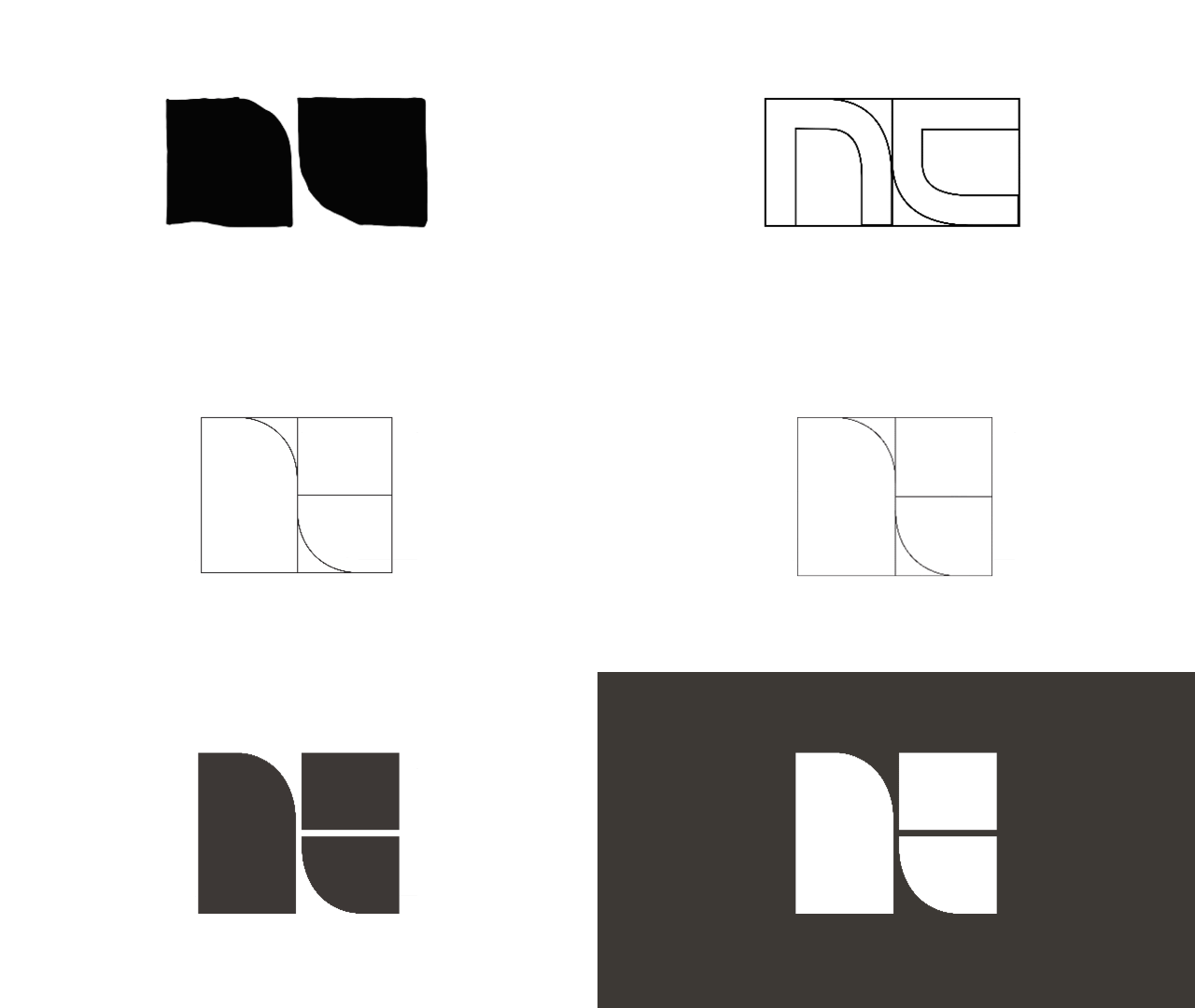
The monogram begins with a shorthand already familiar to the business: NT.
Used by clients, industry peers and the team internally, NT has long operated as a natural abbreviation for nettletontribe. The new mark leans into this existing behaviour, claiming it as a more distinctive and ownable brand asset. The design evolved through an abstraction of the letters N and T, constructed around the proportions of the golden ratio and developed through architectural ideas of figure-ground: the relationship between form and space, object and field, solid and void.
It has been designed as a unique and ownable symbol for nettletontribe.
These changes have been designed to make the brand easier to use and more effective across every touchpoint, from proposals and reports to signage, digital channels, project storytelling, social content and internal communications.
What has not changed is our belief in the work
We believe great design shapes how people live, work, learn and connect. We believe ambition and practicality are stronger together. We believe the best outcomes come from listening closely, thinking clearly and staying deeply involved from beginning to end.
That has always been at the heart of nettletontribe.
We’ve proven that you can be ambitious without ego, commercial without compromise, and human in everything you do.
Our ambition is national, our approach is personal, and our work is built to stand the test of time.